Pie chart: Poetic meters
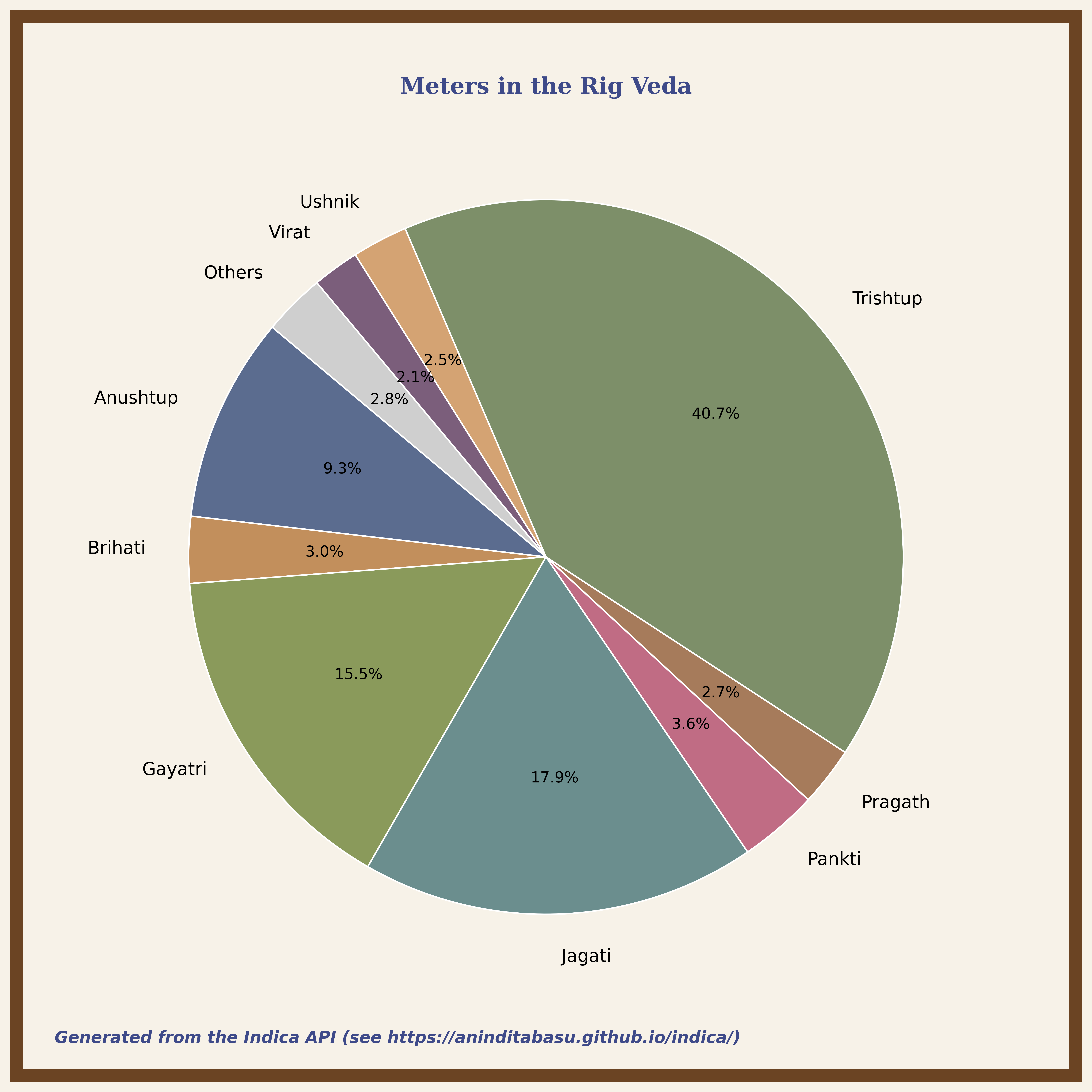
Rig Veda is poetry. Its verses have a certain lilt, beat, rhythm ( meter ) that turn the words into charming lyrical music when recited aloud. This chart of the vedic meters is generated from the data returned by the /rv/v3/meters endpoint.
To see a larger image, click the image.
On this page
What this chart shows
At first glance, the following things stand out immediately:
- Trishtup dominates, accounting for over 40% of the corpus. That makes it the default poetic rhythm of the Rig Veda.
- Jagati and Gayatri together make up another third of the corpus, meaning that just three meters account for most hymns.
- Anushtup, which later becomes the dominant meter of classical Sanskrit epics, is relatively minor here.
- The minor meters together account for only about 17% of the corpus.
From this distribution, one might be inclined to think that Rigvedic poetry relied on a few highly stable rhythmic templates that were used more for structure than for ornamentation or experimentation.
What to explore next
- Why does Trishtup dominate? Is it associated with specific gods, poets, or mandals? Use the
/mandal/{n}/meters,/sungfor/{god}/meters, and/sungby/{poet}/metersendpoints. - Do certain gods prefer certain meters? Use the
/sungfor/{god}/metersendpoint. - Do certain poets prefer certain meters? Use the
/sungby/{poet}/metersendpoint. - Do meters cluster by mandal? Use the
/mandal/{n}/metersendpoint. - Which mandals contain Anushtup, the meter that has only a 9% share here but went on to dominate almost the entire epic literature? Use the
/mandal/{n}/metersendpoint.
Endpoint to use for this pie chart
/meters returns the following response:
{
  "meters": {
    "Abhisarini": 2,
    "Anushtup": 281,
    "Ashti": 6,
    "Atidhriti": 1,
    "Atyashti": 28,
    "Brihati": 91,
    "Dhriti": 4,
    "Gayatri": 469,
    "Jagati": 540,
    "Kakumanyamkushira": 1,
    "Kakup": 9,
    "Kriti": 1,
    "Nyangkusarini": 2,
    "Pankti": 108,
    "Pipilika Madhya": 1,
    "Pragath": 81,
    "Pratishtha": 1,
    "Purastajjyoti": 1,
    "Shakchari": 16,
    "Trishtup": 1230,
    "Uparishtajjyoti": 2,
    "Ushnik": 76,
    "Vardhamana": 2,
    "Virangarupa": 8,
    "Virat": 64
  }
}
Algorithm
Prerequisites
- Dataset: A mapping of category to count
- Threshold: Minimum count for a category to be displayed as a slice
- Colour palette: List of display colours
- Chart metadata:
- Header text
- Footer text
- Background and frame styling
Steps
- Extract categories and values.
- Read the input dataset.
- Separate it into:
labels= list of category names.values= list of corresponding counts.
- Group low-frequency categories so that the chart is not cluttered by numerous tiny slices.
- Initialise:
filtered_labelsas empty.filtered_valuesas empty.other_total = 0.
- For each
(label, value)pair:- If
value < threshold, addvaluetoother_total. - Else:
- Append
labeltofiltered_labels. - Append
valuetofiltered_values.
- Append
- If
- After processing all items:
- If
other_total > 0:- Append
"Others"tofiltered_labels. - Append
other_totaltofiltered_values.
- Append
- If
- Initialise:
- Assign colours.
- Generate one colour for each resulting category.
- If the number of categories exceeds the palette size, reuse colours cyclically.
- If an
"Others"category exists, override its colour with a neutral colour like grey.
- Create the chart canvas.
- Initialise a drawing surface with fixed dimensions and background colour.
- Reserve space for header, main chart area, and footer.
- Add the metadata. Place the header at the top and the footer at the bottom.
- Render the pie chart.
- Draw a pie chart where each slice corresponds to a category and the slice size is proportional to the category count.
- Display the category labels outside or near the slices, and the percentage labels inside the slices.
- Apply visual styling for start rotation angle, slice borders, label distances, and percentage text distances.
- Ensure that the chart uses an equal aspect ratio so that the pie remains circular.
- Draw a border frame around the full visualisation area, flush to the edges.
- Export the output. Save the rendered chart as an image file with high resolution and a tight bounding box.
Pseudocode
function generatePieChart(data, threshold):

    filtered = []
    other_total = 0

    for each (category, count) in data:
        if count < threshold:
            other_total += count
        else:
            filtered.append(category, count)

    if other_total > 0:
        filtered.append("Others", other_total)

    assign colors to filtered categories
    if "Others" exists:
        set its color to neutral

    create canvas
    add title
    add footer

    draw pie chart using filtered counts
    display labels
    display percentages

    enforce circular aspect ratio
    draw outer frame

    save image